Animation Background
Le background animé est l’un des solutions permettant de mettre du relief dans vos interfaces.
Une animation rapide en jouant sur l’opacité du background donne une impression de vie, l’image doit être générée avec une opacité pour obtenir un rendu immersif.
.bg{
   background: url("img/bg.svg");
   background-repeat: no-repeat;
   background-size: contain;
   background-position: center;
   height: 100vh;
   opacity: .45;
   animation: a-bg infinite 5s;
   width: 100vw;
   position: absolute;
}
@keyframes a-bg {
   0%{
      opacity: .45;
   }
   50%{
      opacity: 0.8;
   }
   100%{
      opacity: .45;
   }
}
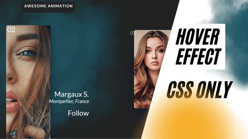
Interaction Hover pour Zoomer sur l’image
L’animation se déclenche sur le hover du parent de l’image, qui doit être suffisamment grand pour permettre à l’effet de fonctionner.
.card img{
   height:50vh;
   border-radius: 10px;
   position: absolute;
   top: 2rem;
   left: 50%;
   transform: translate(-50%);
   transition: 1s;
}
.card:hover img{
   height:100vh;
   top:0;
   left:0;
}
Apparition séquentielle du texte sur l’événement Hover
Effet très populaire actuellement qui permet de rythmer l’expérience utilisateur.
.card .content .txt span{
  display: block;
  transform:translateY(100%);
}
@keyframes a-contentFadeIn {
  0%{
    transform:translateY(100%);
  }
  100%{
    transform:translateY(0%);
  }
}
.card:hover .content .txt span{
  animation: a-contentFadeIn 400ms forwards;
}
.card:hover .content .txt:nth-child(1) span{
  animation-delay: 100ms;
}